Hi,
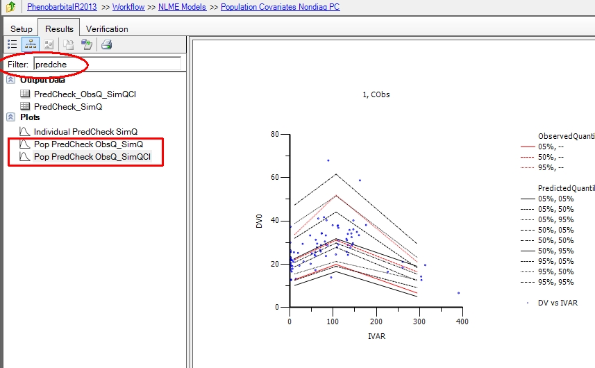
I have one more question. I am running a VPC and I can't find the plot of DV vs VAR over all individuals with the shaded areas which are the liimits.
Can you please help me?
Thanks,
Georgia

Advanced Member

Advanced Member
Posted 01 November 2013 - 12:34 AM
The project I am working on is about a POPPK model of cyclophosphamide in populations with Acute Kidney Disease. So, now I want to check the VPC, but as I am used to working with nonmem, I am a little bit lost with Phoenix. Next stage of my project is to add the metabolite model.
Georgia
Advanced Member
Posted 01 November 2013 - 12:00 PM


Advanced Member
Posted 01 November 2013 - 04:22 PM
 Check.png' alt='Posted Image' />

Advanced Member
Posted 01 November 2013 - 07:50 PM
of course binning is very important.
Phoenix has optimal built in binning using K-means algorithm and more options are upcoming.
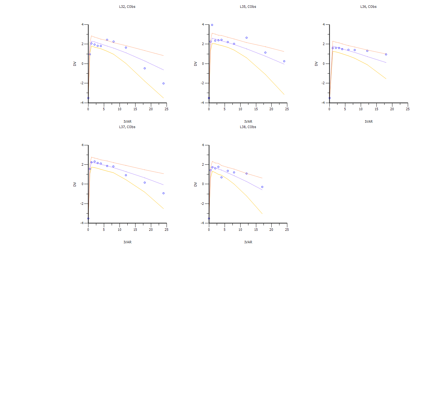
I wrote additional scripts that help visualize the graphs in R lattice or GGPLOT with automatic stratification:
################################################# code starts
# The user is responsible to edit the code to make sure it works for his model
# make sure you have all required pacakges
#Samer Mouksassi
attach(PCDATA) #WNL_IN Scenario Strat IVAR DV0 DV ObsName QI QE#
#PCDATA <- read.csv ("PredCheck_ObsQ_SimQCI.csv")
Stratname <- "Sex"
StratLevels <- c("Women","Men")
Transparencysetting <- 0.2
require(lattice)
require(reshape2)
require(ggplot2)
##########################################################
PCDATA$PK <- with(PCDATA,ifelse( is.na(DV),DV0,DV))
PCDATA<- PCDATA[, c("Strat","IVAR","PK","QI","QE")]
PCDATAm <- melt(PCDATA,id=c("Strat","IVAR","QE","QI"))
PCDATAm <- dcast ( PCDATAm , IVAR +QI +Strat ~ QE +variable)
#PCDATAm $Strat <- ifelse ( PCDATAm $Strat==1,"Men","Women")
# this line above if you want to change the labels
##########################################################
png(file = "vpcplotggplot.png", bg = "transparent")
ggplot(PCDATAm ,aes(IVAR,`--_PK`,ymin=`05%_PK`,ymax=`95%_PK`,fill=QI,col=QI))+
geom_ribbon(alpha=0.1,col=NA ) +
scale_fill_manual(name="Observerd (lines)\nPrediction Intervals (ribbons)",
breaks=c("05%", "50%", "95%"),
values=c("red","blue","red"))+
geom_line() +
facet_grid(~Strat,, labeller = label_value,scales="free_x") +
scale_colour_manual(name="Observerd (lines)\nPrediction Intervals (ribbons)",
breaks=c("05%", "50%", "95%"),
values=c("red","blue","red"))+
ylab("Simulated and Observed Quantiles of\n Concentrations (pg/mL)")+
xlab("Time After Dose (h)")+
theme(legend.position="bottom")
dev.off()
########## the same but with lattice
panel.bands <-
function(x, y, upper, lower,
fill, col,
subscripts, ..., font, fontface)
{
upper <- upper[subscripts]
lower <- lower[subscripts]
panel.polygon(c(x, rev(x)), c(upper, rev(lower)),
col = fill, border = FALSE,
...)
}
png(file = "vpcplotlattice.png", bg = "transparent")
xyplot( `--_PK` ~IVAR |Strat,data=PCDATAm, scales=list(x=list(relation="free")),
ylim=c(min (PCDATAm[,4:7] ,na.rm=T), max (PCDATAm[,4:7],na.rm=T)),
ylab = "Simulated and Observed Quantiles of\n Concentrations (pg/mL)",
xlab = "Time After Dose (h)",
group=PCDATAm$QI,lower= PCDATAm[,5] ,upper = PCDATAm[,7] ,
panel= function(x,y,subscript=T,group,ylow=ylow,yup=yup,...){
panel.superpose(x, y, panel.groups = 'panel.bands',fill=c("red","blue","red"),alpha=0.2, ...)
panel.superpose(x,y,type="l",col=c("red","blue","red"),...)
}
, key=list(space="bottom",columns=2,
text =list(lab=c("SIM 95% PI","SIM Median","SIM 05% PI","OBS 95% PI","OBS Median","OBS 05% PI")),
rectangles=list(col=c("red","blue","red","transparent","transparent","transparent"),alpha=0.2,border="transparent")
,lines=list(lty=c(0,0,0,1,1,1),lwd=1,col=c("transparent","transparent","transparent","red","blue","red"))
)
)
dev.off()
= list(cex = 1.2)
,var.name=Stratname ,factor.levels=StratLevels)
)
,more=F)
dev.off()


0 members, 0 guests, 0 anonymous users


