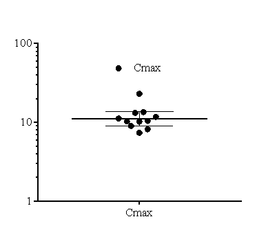
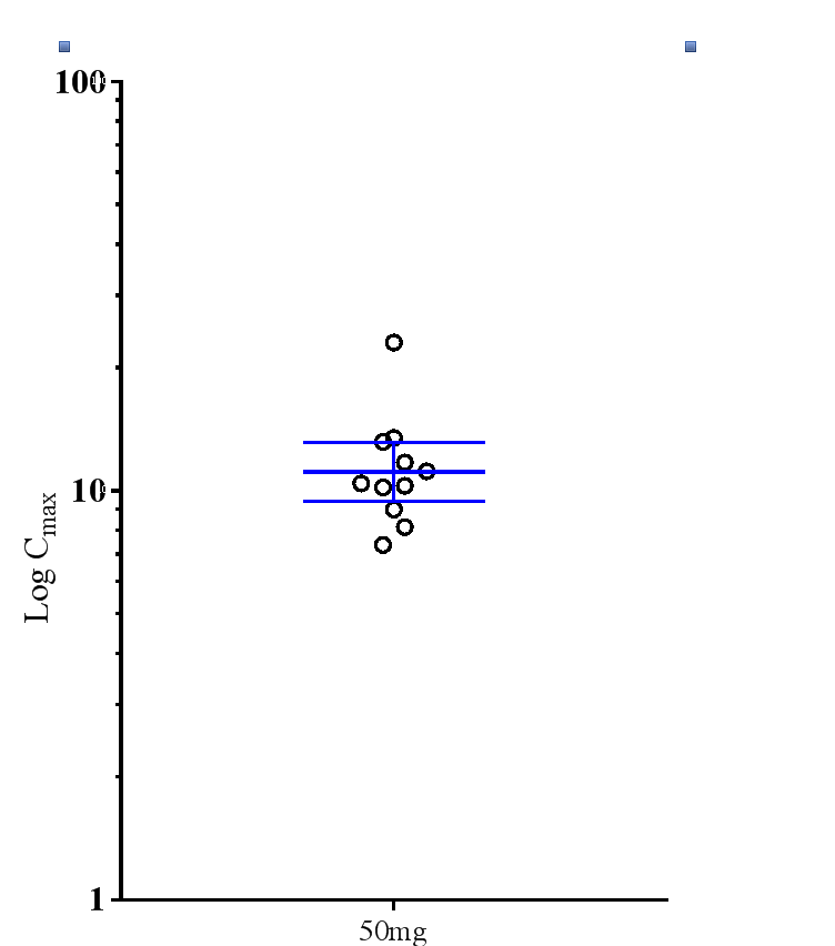
Yes; you can expand the range some what. I must look at how you did this. I have the series of Cmax values onluy need this data.
What is step 1 , step 2, step 3 for me?
Please can you say?
Angus
Hi Angus,
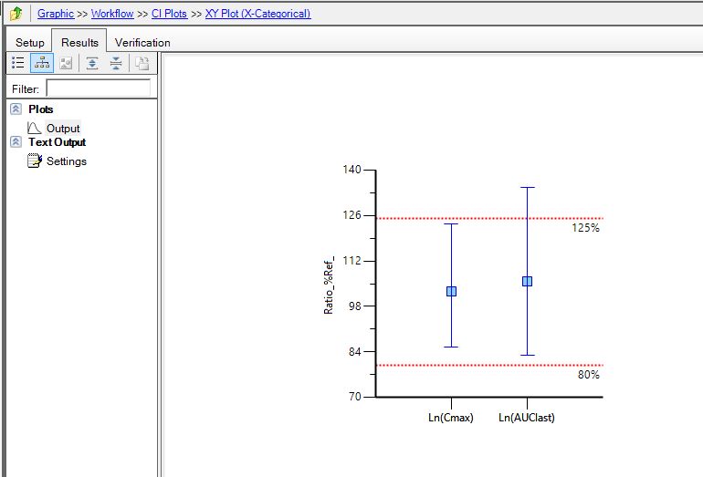
I tricked the program by assigning some arbitrary values: Cmax values had a new column added with a value 3,
GeoMean has a column with two values 1 and 5, and the 90%CI Geo Mean has values two values 2 and 4. I enter
this in a worksheet and then join them with the NCA and Descriptive stats results. Then in the
plot you overlay the data (3 sets) and have those arbitrary values plotted in the X-axis.
You change titles, remove markers from the CIs and plot formats as you wish. It is hard to
explain so better take a look at the project.
Ana
Edited by Ana Henry, 01 June 2016 - 05:21 PM.